A few weeks ago, I was looking for an Airbnb in Austin to share with my girlfriend while we’re in town for a buddy’s wedding. We were specifically looking to find a place that didn’t involve sleeping in an Airstream or someone’s converted garage, and a place where we were unlikely to be awoken in the morning by some hippie’s chickens.*
After some period of frustration handing my laptop back and forth while we browsed listings, my girlfriend had a brilliant idea. She would download the app on her iPad, and then we’d have a slightly less annoying device to pass between us. But then, after a quick search on the app store:
“There’s no iPad app. What the hell?”
I was just as surprised. After all, Airbnb has been around for so long that we just sort of expected there had to be an iPad app. But there wasn’t — at least not until today.
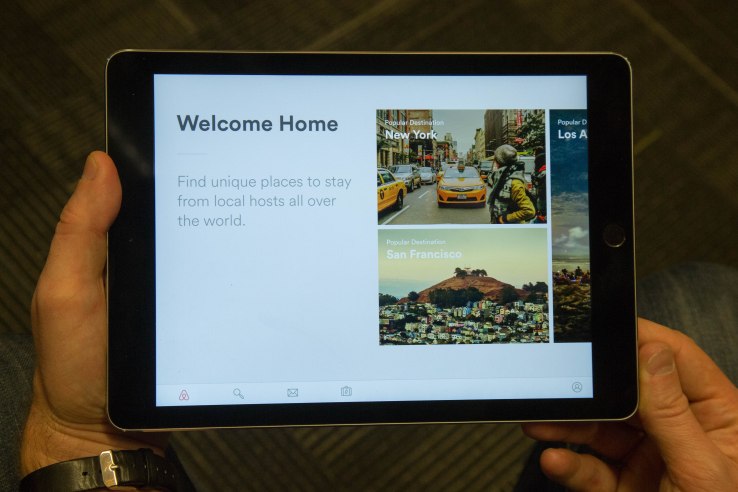
That’s right, today Airbnb is finally** rolling out an app that will enable users to browse and search its listings on a device that’s bigger than a phone, but not quite as unwieldy as a laptop. But more than that, the new app for iPad and Android tablets is designed to provide users with some inspiration for where they might want to take their next trip.
The app was designed to target a huge — and growing! — number of users who already use Airbnb on their tablets. According to Airbnb head of design Alex Schleifer, about 12 percent of all Airbnb users are coming to the site via iPad.
But the company didn’t want to just build a scaled-up iPhone app, or port over a more “native” version of its responsive web experience for tablets. It wanted to build something new and special for tablet users.
Like everything Airbnb does, the tablet app just oozes design. While it’s built for utility — yeah, the search field is just a tap away, and it’s really easy to get over to your messages with hosts or guests — the company also wanted to show off all the wonderful places you could be staying, even if you don’t have anywhere you plan to go.
When you first open it, the what-body-part-is-it Airbnb logo (the Bélo!) appears in animation while the names of different cities flash across the screen. It’s like a loading screen for a video game, but in this case it’s totally unnecessary — except, you know, to look cool.

Beyond that, the app welcomes you with beautiful images of all the various locations you can browse through, letting you swipe right and left between them. It’s meant to feel like you’re thumbing through a travel magazine, which in a way, you kind of are.
“People hold the iPad like a magazine or like a book,” Schleifer explains. “We wanted to bring the quality of print design into the digital space.”
In each viewing mode, the app seeks to highlight beautiful imagery while keeping the nitty gritty details slightly hidden but easily accessible. When you choose a city to browse in, you’re shown large panes of property images with listing price and a short description. Peeking out of the left side of the screen is a map that can be used to bounce around or refine your search, if you choose.
Click through to any listing and you’re engulfed in full-bleed images. Airbnb likes to say it has the largest collection of professional home photography in the world, and the company loves to sow that off in the app. Property information is a flick of the wrist away, slightly hidden in the bottom pane of the screen.
The app also has all the tools hosts have come to expect, including the ability to edit listings, manage their calendars, and also quickly reply to messages from guests. It also provides all host stats and dashboard — what Schleifer calls the host command center.
With the app, Airbnb had a couple of constituencies it wanted to please — those who will use the app mainly for browsing, and those who want to just get down to business and book.
“We thought about how different people use Airbnb. I use it to sit back and explore, let it guide where I want to go,” Schleifer told me, which was behind the idea of making it more of a magazine. But then there are other people, he says, that want the design to “just get out of the way and let me book.”
It was a long time coming, sure, but it appears Airbnb has an app that succeeds on both fronts.
==
* If you’ve ever searched for an Airbnb in Austin, you know this is more difficult than it sounds.
** I really hate using that word, but think it applies in this case.
from TechCrunch http://feedproxy.google.com/~r/Techcrunch/~3/uLwjq-kvDW8/
via IFTTT


0 коммент.:
Отправить комментарий